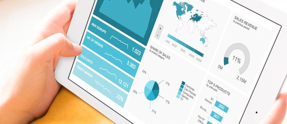
BUSINESS DASHBOARD EXAMPLES FOR EVERY USE CASE
Every organisation and department can benefit from powerful business dashboards in today’s competitive world. These essential tools help visualise the critical insights you extract from your data in an interactive and engaging way by offering centralised access to critical KPIs. State of the art business intelligence and dashboard software plays a key role in the process, as it provides the necessary features to build stunning dashboards to display crucial findings in a meaningful way. Dashboards for business can be of many types, from analytical to operational to strategic – each tracking a certain type of metrics and telling a specific data story. They can focus on particular department tasks and how they perform, or provide a big picture of the current status of overall activities. Working with these modern tools enhances collaboration and improves communication between your team and business units. To help you put their value into perspective, we have created a library with over 100 dashboard examples and templates for different industries, functions, and platforms. All the examples of dashboards feature a large set of KPIs handpicked according to the purpose of use. That way, you have a better idea of what modern dashboarding and reporting look like!

Setup only takes one minute. No credit card required!
BUILD PROFESSIONAL BUSINESS
DASHBOARDS WITH A FEW CLICKS
VISUALISE AND MONITOR YOUR MOST RELEVANT KPIS IN A SINGLE PLACE
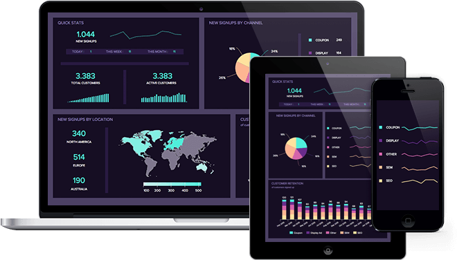
In datapine, we move from “just” real-time access to static data to a more interactive approach that allows enhanced collaboration and communication between key stakeholders. Being able to navigate your information intuitively has become an essential part of successful analysis and we provide you with the needed features to do so.
That said, our software offers you easy and centralised access to all the critical metrics you need to understand your business and react to unexpected events. Our comprehensive user management roles allow you to easily share dashboards full of interesting insights with certain colleagues or whole departments in a secure environment.
In the past years, storytelling with data has become one of the biggest trends in business intelligence. What if instead of a set of static slides you could tell your own story?
With datapine, you can drill-down into data sets of interest in an online environment, navigate through relevant insights guided by predefined paths, go back in time to view historical data, and much more. All with a couple of clicks. This is how we define the future of the visual presentation of information with the help of interactive dashboards.
With that power in hand, everyone in your company will have access to professional dashboard examples to boost their decision-making. Any user without the need for technical knowledge will be able to display charts in different shapes, colours, sizes and order they might need to answer their most vital questions. The dashboards are browser-based, meaning they can be accessed from any device with an internet connection and easily shared across your company or customers, allowing its recipients to build their own story by using a wide range of interactive exploration elements. It’s easy, fast, and your tech department won’t need to be involved in any development.
To get some inspiration, check out our stunning dashboard examples and templates above, where you will find a range of use cases for multiple scenarios. These templates will help you understand the value of these tools and how they can boost collaboration and productivity and propel business growth at the same time.
ELECTRIFY YOUR DATA EXPLORATION WITH
INTERACTIVE DASHBOARDS
FORGET FORMAL PRESENTATIONS, INTERACTION WITH YOUR DATA IS WHAT WE OFFER
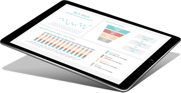
Imagine starting your day with a one-minute overview of every metric that matters to your business, all beautifully visualised in easy-to-understand graphs and charts. That’s the one minute you need to get an overview of your operations and ensure your business is performing as expected. That same minute can also allow you to spot any issues and tackle them immediately, avoiding any big consequences to the organisation.
Without datapine, your data might be stored across different platforms. Information dispersed across an unconnected collection of databases, spreadsheets, systems, and applications makes it hard to see the big picture. Checking through these sources to grasp important facts takes up a lot of time and can also be intimidating for most average business users. Instead, we want to give you, and everyone in your organisation, the power to allocate all this time to making improved decisions in a user-friendly environment.
Typically, gathering all information in a single place is hard, but “typical” is a part of the past. With datapine, you won’t need to occupy your tech team with a weeks-long data visualisation project or need to learn special skills or programming languages either. Our tool allows you to start visualising and sharing your most relevant performance indicators in a matter of minutes.
Our professional dashboard creator empowers you to build compelling stories with your data. We let you monitor and compare KPIs in real-time, create geographical maps and dynamic reports in a matter of seconds. Various interactive control elements allow your dashboard recipients the possibility to drill down into specific data sets, filter the whole dashboard by certain criteria, or browse through a number of preselected data series. Thanks to the ease of use and plenty of KPI examples for inspiration, it will take minutes instead of weeks or months to get started.
Don’t take our word for it. Scroll up and explore our library with over 100+ dashboard examples and see all of these functionalities in action!
GIVE YOUR TEAM ACCESS TO VISUAL STORIES WITH LIVE DATA
KEEP EVERYONE IN THE LOOP WITH REAL-TIME DATA, TO REACT IMMEDIATELY AND FORESEE THE BEST OPPORTUNITIES FOR YOUR BUSINESS
Sharing is caring. This is especially true when you share relevant metrics and insights with your team. Our dashboards provide a neat solution to the mind numbing but avoidable request: “can I have an update on….” Being updated with the latest KPIs means more effective meetings and informed decisions.
With datapine, teams can access, watch, and interact with the data that matters to them. Empower your employees to make their own queries and generate insights themselves. Sharing a dashboard is as easy as sending a link. With one click, everyone is up to date.
Your team can access datapine on their smartphones, tablets or in their browser, with the degree of interactivity and accessibility you assigned to them. With this granular access management, you can ensure that each recipient only sees the data that is relevant to them.
Another way to keep your colleagues, partners and shareholders in the loop is to schedule automated reports at your preferred time and frequency. Each of these reports can also be exported in a PDF, CSV, or PNG format.
Last but not least datapine is 100% embeddable within internal business applications, external portals, or commercial software products to improve their analytical function range. Learn here more about the functionality and benefits of our state-of-the-arts embedded dashboards.
Setup only takes one minute. No credit card required!
Why Are Business Dashboards Important For Modern Business?
No matter what sort of business you own, operate, or manage, there are countless gears and cogs constantly turning in order to make it work. From the supply chain and suppliers to finances, accountants, production line management, customer relations and management, hundreds of facets affect your business’s ultimate success or failure. This is a lot to monitor, and it is even more difficult to consider every aspect of your business impartially and simultaneously.
A modern company dashboard is a sort of informational tool that helps you manage the hundreds of vital parts of your operations. This management tool simplifies large, complex data sets into manageable and meaningful visualisations that can be utilised to make responsive adjustments and ensure a smooth and profitable course of operations. These visualisations center around revealing and demonstrating trends, ratios, gross and net fluctuations, market concerns and any other relevant knowledge to your business. Some other benefits include:
Centralised view of KPIs: The importance of dashboards is that they provide an at-a-glance overview of how your entire business operates, much like a dashboard in a car. These are not oversimplifications, but rather consider every piece of information in order to paint a coherent and accessible picture of your operations. While drivers rely on their automobile dashboard to ensure a safe and secure journey, so too are dashboards becoming ever more important in today’s business climate. To assure your organisation’s longevity and stability, dashboards benefit your entire endeavor by simplifying otherwise overly complex information into a unified interface.
24/7 live access: In order to make the best strategic decisions, you need 24/7 access to your most critical insights. A modern dashboard provides full access to your data from any location. The flexibility of these analytical systems makes it possible to see your data in different formats from different devices. All you need is an internet connection and you will have full access to live data on the go. This will allow you to stay on top of any issues and avoid the tedious task of going through infinite databases to get a piece of information.
Enhanced team communication: As seen in our extensive library of dashboard examples, these tools are important for many reasons; they allow you to gather as many meaningful details as possible from large data sets, they consolidate information into a single, legible interface, they save on time and manpower, and they provide an objective recapitulation of progress to serve as a foundation for discussions, team-building and future projects. Allowing for enhanced communication between critical players. Like this, a collaborative data-driven culture will be implemented, and the company will thrive with it.
Which Different Types of Business Dashboards Exist?
The use of company dashboards is becoming increasingly more mainstream in today’s economic climate: not simply for their ease of accessibility, but because of their inherent ability to be custom designed for a particular operation, depending on the goals of the organisation and what information is necessary to have on hand. It comes down to the questions, ‘what problem do you need to solve’?
There’s a myriad of types and customisations of dashboards. However, there are three primary types of business dashboards: analytical, operational and strategic. Let’s look at each of them separately:
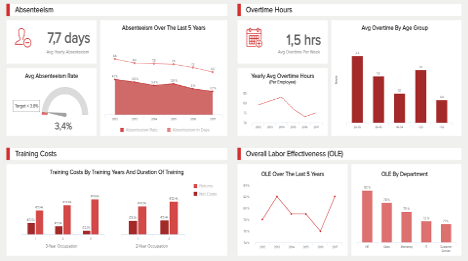
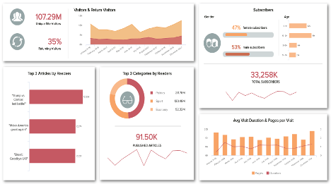
Analytical business dashboards: This type is designed to provide insights based on data collected over time; they answer the question ‘how is your business doing’, based on in-depth analyses of data collected during your past operations. They can be employed to identify patterns and opportunities, design strategic aims and compare trends over time. In the simplest sense, analytical dashboards help you evaluate the current status of your business and address questions such as; are profits higher or lower than last year? Where are our most and least productive operational regions? Has a particular marketing campaign been successful?
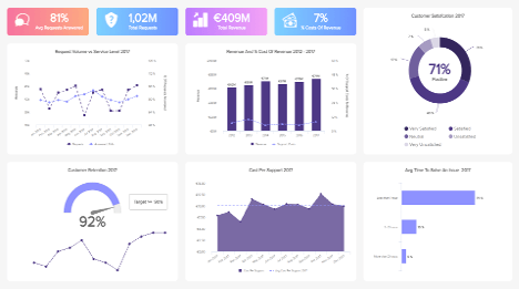
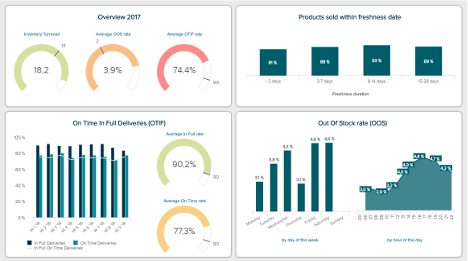
Operational dashboards: Designed to help reveal whether business operations are on track or not. They can be used when it is imperative to act on issues quickly, for example, regarding sales, marketing, customer services and queries, and supply-chain management. While there are inevitably some similarities between analytical and operational dashboards, operational dashboards specialise in the ability to help you develop forecasts and business predictions, and to act on essential information immediately.
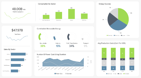
Strategic dashboards: This type offers a long-term overview of an organisation’s strategies on an enterprise level. They display complex, high-level KPIs that are mostly used by C-level decision-makers. Enabling them to understand the progress of general company goals on a quarterly or yearly basis. These dashboards enable executives to spot weaknesses in their general strategies, granting them opportunities to improve and boost growth.
There are many variations of dashboards, and even analytical and operational ones can be tailor-made for your particular aims. It is merely a matter of identifying the relevant information and your entrepreneurial aspirations, restrictions, strengths, and weaknesses.
Setup only takes one minute. No credit card required!
10 Simple Best Practices For Your Business Dashboards
Dashboards are a vital part of any organisation and may serve as the foundation for any meeting, investigation, or decision-making process in your company. They are a succinct and valuable source of knowledge, and their growing recognition is unequivocally due to their universal relevance. Now that you are ready to design or employ a dashboard for your business, whether an operational, analytical, or custom-built one like one of the company dashboard examples above, there are certain rules which you must follow. We will cover some of the most important ones next.
1) Define Your Goals: The first best practice you should follow when generating your dashboards is to define your goals. This will enable you to choose the right data sources and KPIs to track your efforts towards those goals and avoid drawing in massive amounts of meaningless data. Setting clear goals will help you narrow the scope of your analysis to ensure strategies are generated based on key valuable insights.
2) Make Your Metrics Matter: The hours spent designing and implementing a dashboard will not be useful if the information contained is irrelevant. Make sure to research what details are actually necessary to include before beginning to design it.
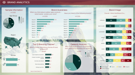
3) Select Your Sources: Expanding on the point above, in order to understand what kind of indicators you will need to include, it is also necessary to define what kind of sources you will use. This can be external or internal depending on the purpose of the analysis. Refer to our dashboard examples above to see a range of data sources related to finances, customer service, logistics, marketing and much more.
4) Stick to Visuals: Any designer will tell you that relying on words, sentences and writing is often tempting to get a message across. That said, it is a proven fact that the human brain processes visual information better than text. Therefore, keeping your dashboard clean, simple, and visually driven will ensure you are successful in your analytical efforts.
5) Make it Interesting: Sifting through excessive information is boring. Utilise the directness of visualisations to maintain your audience’s attention. When you can make your dashboard interactive, you guarantee a more interested audience and more robust transmission of relevant facts.
6) Make it Interactive: As mentioned throughout this page, the value of these tools lies in their interactivity. Interactive features allow you to navigate and explore your data to answer any critical question that might arise during the analysis process.
7) Only Use Relevant Data: If your data is erroneous, incomplete or inaccurate, there is no sense in creating a dashboard. Take the time and invest the right efforts in research and the final product will be exponentially more effective.
8) Provide Context: Another important best practice is to provide context. Build a story with your data that will allow any stakeholder to understand what you are trying to portray. This will shine a light on important achievements and will make the analytical process more efficient.
9) Be Mindful of Security: Security is often overlooked in the dashboarding and reporting process. However, with the rise in cyberattacks, security must become a priority as the consequences of these attacks can take a big toll on a business’s reputation and financial health. To prevent this, ensure strict access controls are in place for any sensitive data contained in your dashboard.
10) Simple and Accessible: Dashboards are only valuable if everyone can assess them; the information should be clean, accurate, direct, and easily understood from the first instant.
10 DESIGN BEST PRACTICES FOR YOUR OWN DASHBOARD TEMPLATES
Creating great dashboards isn’t as hard as it used to be thanks to modern dashboard designer software and their intuitive approach. However, it hasn’t become a no-brainer either. Dashboard design is the cherry on top of your BI project and you still need some strategic thinking and good judgment when it comes to design principles. Here are a few tips for you to create beautiful business dashboard designs:
1) Use The Right Type of Chart: Different charts tell different stories. Therefore, choosing the right visualisation according to the information you want to convey bar charts, columns, lines, spider’s web, scatter plots… is of utmost importance. There will always be one that fits best.
2) Have Colour Consistency: Whether you choose to stick to your company’s or client’s colours, stay consistent. You can pick up to 3 main colours maximum and stick to them, to avoid messiness and a too strong mental effort from the reader. Intense colours are also to be avoided.
3) Prioritise Simplicity: Rather you are generating a dashboard for your team or an external stakeholder, keeping the design clean and simple should be a top priority. Avoid adding unnecessary gridlines or text, and most importantly, stay away from 3D effects as they make the charts way harder to understand.
4) Stay Away From Clutter: Putting all the information on a single page doesn’t work. It just confuses the reader more and doesn’t convey your message correctly. Use separate tabs on your business dashboard templates to show different data according to your audience needs: a marketer doesn’t require the same information as a financial manager.
5) Put Yourself In Your Audience’s Shoes: Build the best business dashboards for individual needs. Will you share it with many different people with different needs? Will it be viewed in silence at an office desk, or presented among various screen types anytime it is needed? The reader must be able to employ the information in whichever situation he/she is in.
6) Use Text Wisely: Text plays a crucial role in the correct understanding of data. That said, you should make sure you use labels and legends wisely to avoid overcrowding the dashboard. It is also a good practice to think about the level of expertise of the audience and add text in strategic sections to help them grasp the information better.
7) Customise The Dashboard: Customising your dashboards to match the company’s branding, such as its logo, colours, and font will help the audience feel more engaged with the visual as they will see a familiar design. This can be done with the assistance of white labeling technologies provided by datapine.
8) Think Of Mobile Optimisation: Optimise your design to fit into smaller screens such as mobile or tablets. Here you should prioritise the placement of high-level metrics that are critical to the user as all of the ones displayed on a desktop will not fit on the smaller screen.
9) Keep Graphical Integrity: This basically means avoiding any incorrect use of visualisations that can lead to a misinterpretation of the information. The data portrayed in your graphs and charts should speak by itself. Avoid trying to show a specific conclusion that might benefit your analysis.
10) Take Advantage Of datapine’s Dashboard Templates: Last but not least, we have created over 100 dashboard examples that you can use as an inspiration for your own. Sorted out per function, industry and platforms, they gather specifically related KPIs you need to track to ensure performance is improving.
Setup only takes one minute. No credit card required!
10 Business Dashboards Features That Are Essential
Now that you have a couple of best practices and important design principles in mind, let’s look at some essential features a solid dashboard application should provide you with.
1) Global styling options: To customise your dashboard to your company’s or client’s brand identity with one click, you need advanced global styling options that let you change fonts, colours, texts, charts, and more.
2) Predefined dashboard themes: By saving predefined themes that you create, you can switch and opt for another style in a click. You can also choose among the pre-set themes library to find a look and feel that fits your data story.
3) Existing library: You can create your own themes, but you can also take advantage of our extensive library of 100+ dashboards examples that provide you with specific KPIs according to the function and industry.
4) Advanced charting options: To take your analytical efforts to the next level an advanced charting option is necessary. With the possibility of adding a secondary axis or combining multiple chart types into one, this feature will help you visualise your metrics more complexly to extract deeper conclusions.
5) Widget linking: Widget links unify various sources of information to make your analytical process more complete. It can be a textbox, a chart, or an image that links to other related content – another dashboard tab, external website, or resource.
6) Time interval widget: This widget unclutters your dashboard even more as you do not need to put several identical charts but with a different time-axis. It lets you drill-down into your data according to the time scale, and look at it on a daily, weekly, or monthly basis while keeping the time-period initially displayed.
7) Multiple sharing options: To foster collaboration and enhance the data-driven culture within your team, sharing your dashboard samples is essential. With this option, you can choose the interactivity degree you want to share them with, if it is a public URL for external use, and the frequency of automated email reports.
8) Embedded analytics: When the multiple sharing option isn’t enough, there can still be the possibility to embed internal company data on your intranet, on your website or app. Embedding a dashboard in your personal environment and even white labelling should be available.
9) 24/7 availability: When your data is live 24/7, so should your dashboards. Modern BI software should provide access to your dashboards wherever you are and whenever you need them.
10) AI features: Artificial intelligence features such as data alerts will notify you as soon as a goal is met or an anomaly occurs. Thanks to neural networks and pattern recognition, these alerts are constantly monitoring large volumes of data and can help you prevent issues and save you hours of manual monitoring.

"Importing CRM data dump allowed us to quickly visualise and segment our data for analysis."

"datapine's solution did not disappoint us: we had some serious challenges with very complex data sets and their team really helped us out."

"datapine allows access to visualised realtime data to us and our customers – hence we can spend our time implementing the results."

"We were amazed how easy it was to use datapine and get the first KPIs within a couple of minutes."

"datapine makes it easy and fun to do reporting, presenting complex data into beautiful dashboards."

"We use a white labelled version of datapine to better visualise the data that our hygiene management system captures. This data enables our clients to ensure their facilities are always clean and hygienic."

"With its unique combination of scalability, ease-of-use and functionality, datapine changed the way we analyse our data."

"Thanks to datapine we are able to review all relevant customer data and react on trends and opportunities much faster."

"The combination of a supportive team and a powerful tool make Datapine an amazing solution to monitor the KPIs in our company."