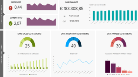
Human Resources Dashboard examples
An HR dashboard is an advanced analytics tool that displays important HR metrics using interactive data visualisations. It helps the HR department to improve recruitment processes, optimise the workplace management as well as to enhance the overall employee performance.
Just like so many of today’s business departments, human resources is slowly but surely evolving into a data-driven function. Filled with numerous HR KPIs, the purpose is to go from simple reporting to smarter use of analytics, enabling companies and managers to track and predict employees’ performance, make better-informed talent decisions, and have the opportunity to operate advanced workforce planning with the help of modern HR analytics software. Turning to a professional online dashboard, HR professionals can keep a close eye on employee performance, recruiting, and talent management processes.
Here we present and analyse the top 6 HR dashboard examples for various application areas in the human resources industry or department:
Employee Performance Dashboard - Recruiting Dashboard - Talent Management Dashboard - Workforce Dashboard - Diverstiy Dashboard - HR Executive Dashboard
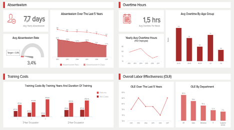
Employee Performance Dashboard

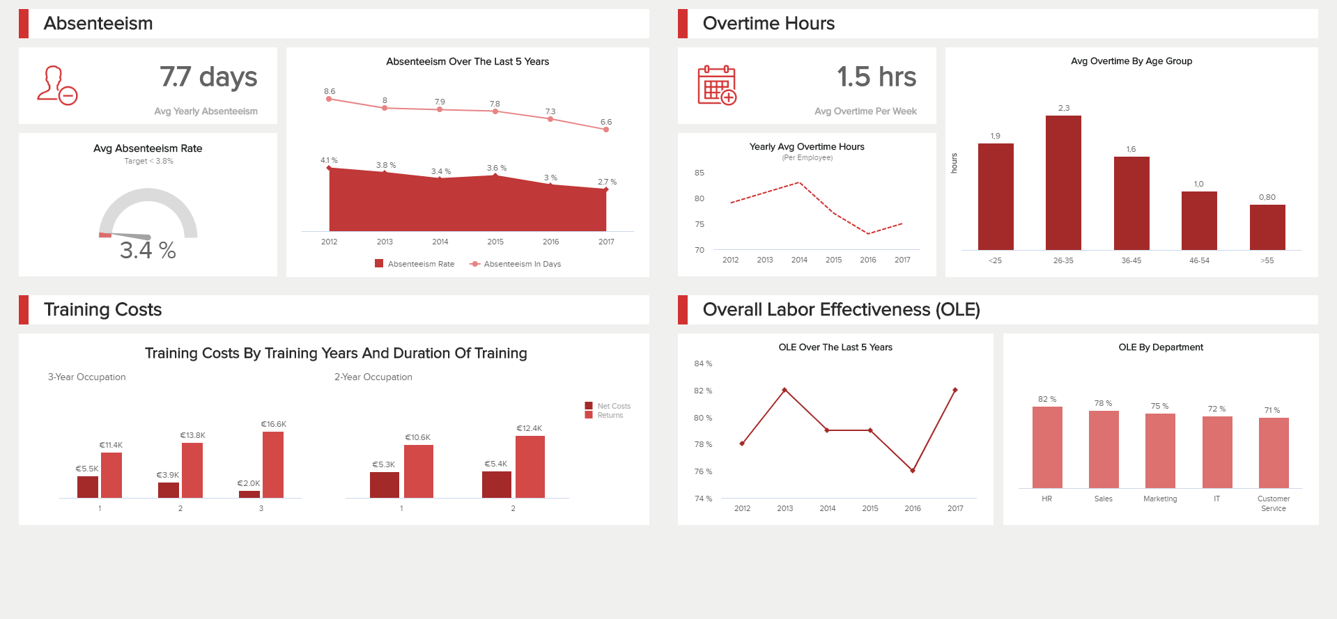
This first human resources dashboard focuses on the employees’ behaviour and performance. It provides an overview for managers of their workforce and how they work: the first part on top of this HR dashboard informs us of absenteeism, the average yearly absenteeism in days, the average rate and their evolution over the last five years. This is an important indicator that illustrates the workers’ engagement and motivation. Indeed, low-motivated workers are more likely to call in sick or skip workdays, and their overall productivity is naturally impacted. This is a metric to keep under your watch because a high absenteeism rate will really harm your finances and your business in general, so digging into the potential causes and reasons for absenteeism is a must-do.
The second part of this HR dashboard looks at the Overall Labour Effectiveness (OLE), i.e. employee productivity. It helps to measure workforce efficiency over time according to specific criteria and goals your business sets. The ‘traditional’ approach to work such as the 9-to-5 workday is changing as flexibility becomes the main requirement for new generations of workers. So, the traditional way of measuring performance by watching who is showing up and for how long is increasingly obsolete – what matters is what people have actually achieved. This is why setting up an employee productivity index is important, and even if it is traditionally measured by dividing the total sales by the number of employees, the standards change from one organisation to another, from function to function, and have to be tailored to your business specificities.
Another metric you can track on your HR dashboard template that is linked to the previous ones is the average overtime hours worked by your employees. Tracking the overtime hours is a good thing to see if your personnel is understaffed, or may lack a bit of training in certain areas, which will impact their productivity. It can also indicate a sudden rise in activity and business growth. But it shouldn’t become the norm, because constant high pressure and work fatigue will inevitably lead to demotivated and unsatisfied employees who will then tend to not show up or call in sick. A simple way for you to fix abnormally high overtime hours is to hire and train new workers. That might impact your finances and momentarily increase your training costs, but it is always a certain risk to take and when the hiring is done correctly, the return on such investment always pays off.
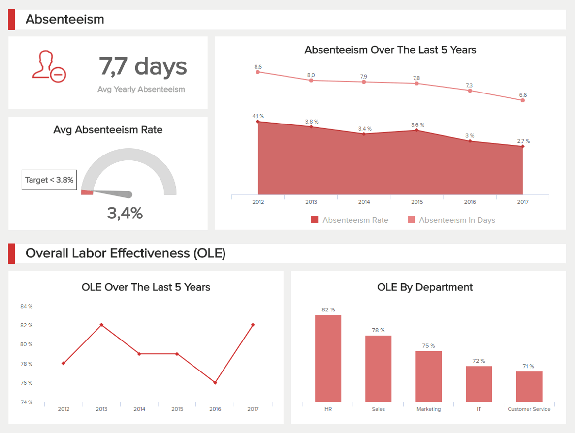
Another important aspect of HR is recruiting new talents. This is where HR analytics can play a significant role, as these insights give the opportunity to link business directly to new talent strategies. The human resources dashboard you build will elevate simple metrics, by linking them to one another and visualising them as a whole. They hold the power to witness the contribution your employees are making to your business outcomes in a wide variety of ways.
Our Recruiting dashboard provided above focuses on recruitment metrics for HR professionals as well as recruited people. Evaluating your recruiting funnel is the main task to do in order to have an idea of the number of applications your recruiting team has to review, how many of these actually pass the first round and get an interview, and how many of these interviews lead to assessment and then hire. The same applies to your recruiters’ conversion rates: more than measuring their capacity to employ many people, they rather measure the efficiency of certain recruiting methods comparatively to another. The goal is, of course, to find the right recruitment approach, one that gives you the best candidates at the lowest cost; the next step will be to invest in that recruitment source.
To find out what is the best way to recruit, you also have to compare it to other KPIs like employee retention after 90 days, or employee turnover. The employee turnover is an important metric you can find on every HR dashboard example because it tells a lot about what is happening inside a business. It measures how many of your workers leave voluntarily or not, and is a good indicator of whether your company is good at retaining talent. As we know, people leave their managers or the company atmosphere rather than their job, so a high turnover rate indicates a problematic situation. You should focus some efforts on finding the why and how of such a situation to fix it, or it will keep on costing you a lot of money – hiring, training, and general benefits to investing all over again when replacing someone who left.
Finally, our HR dashboard template displays some money matters. As we previously said, training has a cost, and so does hiring. You need to mobilise teams of professionals to receive and review the applications, conduct interviews, assessments, and be in touch with applicants and then future hires. It is a lot of time and money investment, which is increasing with the seniority level: experts and top-responsibility positions need a longer recruitment time, as the assessment is more complex – but the training might be slightly lower.
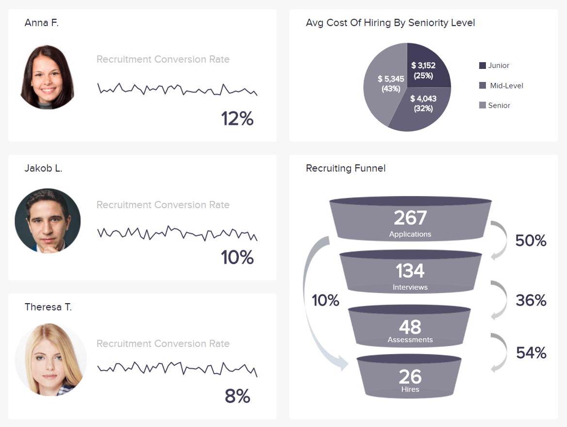
Obtaining the best possible talents as well as keeping them for longer periods of time has become one of the challenges that modern companies need to properly address in order to stay competitive. An employee dashboard that is focused on modern talent management helps in analysing and monitoring costs, hiring stats, turnover, and satisfaction rates, among other critical metrics. Our rundown of the best HR dashboards continues with talent management, one of the key components of attracting, keeping, and improving the talent lifecycle.
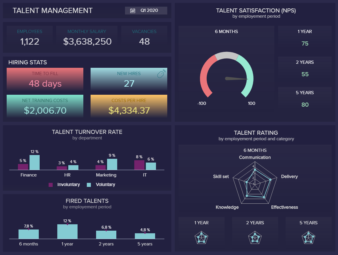
The dashboard starts with a quick overview of the number of employees, monthly salary, and vacancies for the first quarter of the year, followed by hiring stats (time to fill, new hires, net training costs, and costs per hire). The talent turnover rate is represented by different departments while the percentage of laid-off people is depicted through periods of 6 months, 1, 2, and 5 years. Here we can see that the involuntary or unwanted turnover is particularly high in the IT department while, on the other hand, you can see that most talents are laid off during the first year. These findings can help you in adjusting your HR strategies and dig deeper to find out why.
In this HR analytics dashboard talent satisfaction is measured through the net promoter score (NPS) and analysed through the different lengths of time with the company. In this case, it’s evident that satisfaction is highest after 5 years, although the first year was positive as well. The talent rating is represented through 5 main criteria so you can immediately spot that most talents have a good rating. Here you can also brainstorm ideas on how to increase the ratings and improve your relations with employees to reach your satisfaction goals. An additional visual that covers the rating through a 3-month period can tell you that the lowest rating was in February but, still, March improved so you might want to keep an eye of this metric in the future to find out why some months have underperformed.
The final part of the KPI dashboard on the right measures the trends by category, where you can see how well employees develop their skills, knowledge, effectiveness, communication, and delivery. In the last 6 months, the team had the highest rating in the delivery category but lacking the same in the skill set. We can see that after 5 years the skill set still has the lowest value so it might make sense to include additional educational opportunities so that the skills correspond with other categories on a closer level.
As you can see, with the help of our HR metrics dashboard we have identified some points that could need improvement and additional adjustments in your HR strategy. Keep in mind that you need to focus on retaining the right talents and keeping them satisfied to avoid high turnover rates and, subsequently, costs.
We know it already, but we will say it again: companies that are successful at leveraging their HR analytics will be positioned to outperform their peers when it comes to talent strategies. Hence, it is crucial to know who is working in your company and how.
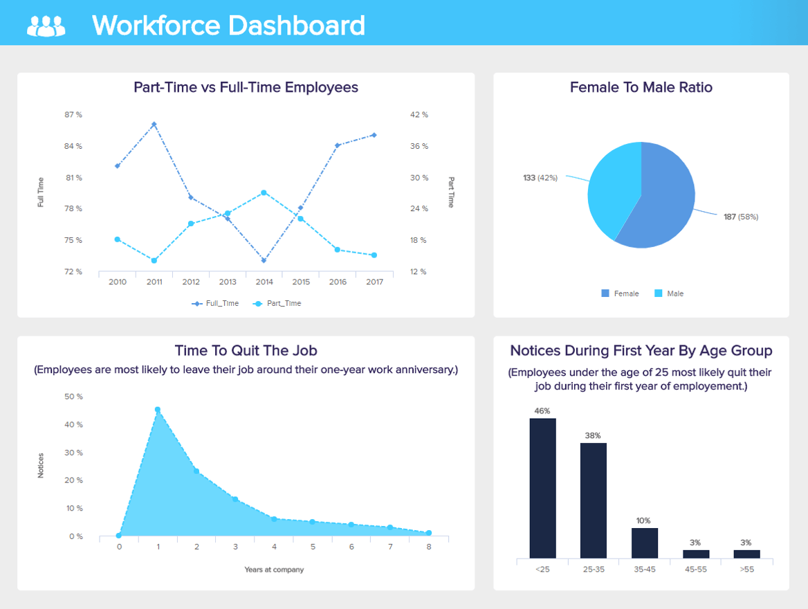
Our next human resources dashboard example will look at general workforce metrics. The evolution of the full-time vs. part-time employees is a good KPI to start in our example above, we can see that the number of full-timers decreased importantly while the part-timers grew significantly. Many reasons might explain this shift, the main one being obvious financial difficulties, or a decrease in activity that needed fewer people working 40 hours a week. Looking at the employees’ behaviour during their first employment year, what jumps out is the tendency to leave a position after around a year. This is not an isolated case, and today’s businesses are changing so swiftly that the one-year anniversary can often be a turning point. And this is a tendency we can observe mainly in young workers under 25, for whom 46% are likely to leave after their first year.
This HR dashboard also addresses the diversity issue: often enough, the female to male ratio is unbalanced, namely in top-management positions with responsibility, power, and money. For a balanced, innovative, and better working business where employees are generally more satisfied and performant, countless studies have shown the importance of diversity – gender-wise, nationality-wise, curriculum-wise, and age-wise. Therefore, monitoring this KPI is important for the well-being of your organisation and its future success. We will talk more in depth about the topic of diversity in our next example.
Finally, you can push your analysis a bit further and look at how your internal network is functioning. Often, by going through your own talent pool of employees and teams – people who already know the company, the sector, the products or services, and how things are working – you will find a wealth of profiles matching the job you wish to fill, and these profiles can also be willing to move forward in their career and grow within the company. It is a gain of time and money, once again, and what you have not spent hiring externally can be smartly reinvested in providing extra training to the employee moving internally, because it is always needed and welcomed.
Allowing your employees to evolve within the structure is a competitive advantage as they will be more committed to their work and will be more motivated globally to move forward. It also shows that you recognise and appreciate the good work they put into their job. But this metric should, however, remain reasonable: recruiting outside also means getting an external point of view, a fresh vision of the business, its operations and processes, and friction always increases the chances of innovation and thinking outside of the box.
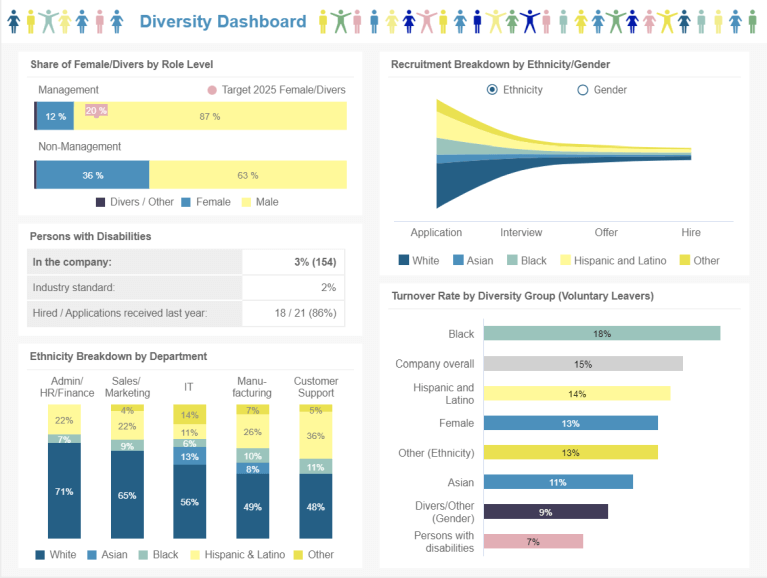
Diversity in the workplace is no longer optional. Today, more and more organisations realise the benefits they can reap from hiring a diverse labour force. Having people from different backgrounds and cultures allows for an exchange of experiences that can lead to increased creativity, productivity, and efficiency. However, while there is a recognition of the benefits this can bring, having a diverse environment still presents a challenge for many organisations and HR departments. For that purpose, our next example covers fundamental diversity metrics to ensure you are on the right path.
Taking a deeper look into the diversity dashboard, we first get the gender share in managerial positions. Here we can see that males occupy the majority of these positions. However, this has been noted, and there is a target to increase the percentage of female and diverse personnel occupying managerial positions by 20% in 2025. The dashboard also offers a breakdown of gender share by department, which you can visualise in the live version of the dashboard.
Next, we get a recruitment breakdown by ethnicity and gender. This information can be complemented with the breakdown by department, where you get detailed insights into how diverse your teams are. Here we can see that the fields of administration, HR, and finances are the least diverse. This is not a surprise, as according to a survey performed by Gartner, finances is the least diverse corporate function. That said, this presents an opportunity to look into the data and find solutions to make these positions more inclusive.
Moving on to a different side of things, we get insights into the turnover rate by diversity group. This metric tells you valuable information about how satisfied your employees are with your organisation. In this case, we can see that Black workers are at the top, with an 18% turnover rate. This can be compared with the employee satisfaction (eNPS) metric where we also find that Black employees are at the bottom of the list with a score of 63, way below the satisfaction target of 75 (open live version to see eNPS graph). This can clearly tell us that there is something happening with Black workers that needs to be looked into in order to avoid increasing their turnover rates.
Last but not least, the diversity dashboard example provides data about disabilities. Often times when we talk about diversity we might think of gender and ethnicity alone. However, people with disabilities also face a lot of challenges when it comes to finding diverse workplaces. Here we get a small breakdown of workers with disabilities in the company. In this case, the organisation is above the industry standard of 2%, which is positive, and the eNPS for people with disabilities is above the target which means they feel comfortable in the company.
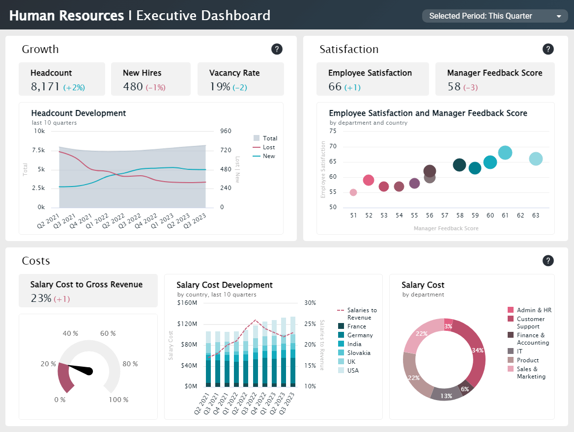
The increasing competition to hire the best talents across industries has led businesses to elevate the importance of their workforce management initiatives. Making sure employees are happy and comfortable in the office can have a significant impact on productivity and profitability. Therefore, paying close attention to this area can reap big rewards in the long run. Our final HR dashboard template helps with that goal by offering a mix of high-level metrics for the CHRO, CPO and other executives with a quarterly focus. The dashboard is divided into 5 categories: growth, diversification, satisfaction, costs, and retention. Offering a 360-view of all employee-related aspects that are important for the development of the organisation as a whole. To see the 5 categories in full, please open the live version of the dashboard.
The first section of this template, referred to as growth, displays a headcount development chart with insights into lost and new hires compared to the total headcount of the last 10 quarters. For a company of this size, with 8.000 employees worldwide, tracking headcount development closely is extremely valuable as it provides a base for future budgeting decisions, labour distribution, internal promotions, and new hires, among many other things.
Moving on to the diversification section, we get insights into the gender ratio by department. As we mentioned in our previous HR dashboard example, a diverse workforce is one of the most important requirements for young talents when choosing a company to work for. Therefore, making sure all diverse groups get the same opportunities is of utmost importance. Here, we can observe that only 16% of management positions are occupied by female employees, this is something that needs to be looked into to make sure both female and male employees are given the same opportunities to grow.
On that same note, the satisfaction and retention sections also offer valuable insights into how employees feel in the organisation. For example, the employee satisfaction and manager feedback chart combines both scores to understand how the way an employee perceives their manager can influence their satisfaction levels. This is the case with the customer service department and the country France, both with low scores, which you can see by hovering over each value in the live version of the dashboard.
Lastly, the template dives into a less human-related section but equally as important for HR executives: costs. Here, we see three charts displaying the salary costs to gross revenue, a salary cost development for the past 10 quarters by country and salary costs by department. By looking into these charts, HR managers can extract valuable conclusions to optimise costs and ensure high revenue. For instance, by looking at the salary cost development for the last 10 quarters we can observe if this business successfully utilised its workforce to generate revenue. Naturally, you want to keep your salaries to revenue ratio as low as possible; therefore, looking into periods when the company succeeded at it is a good exercise to extract valuable conclusions. Likewise, in our example above, looking at periods where the business had a higher ratio such as Q2, Q3 and Q4 of 2022, can also provide valuable insights to improve. The template allows you to filter the entire dashboard by a specific quarter to get detailed data.
As seen throughout this list of interactive human resources dashboards, there is no denying the power that these analytical tools can bring to your organisation. By working with real-time HR data, you will not only boost your productivity but will also ensure a great work environment and high employee satisfaction levels. If you are ready to make your HR department data-driven and reap the benefits of informed talent-management decisions, try datapine for a 14-day free trial today!

Setup only takes one minute. No credit card required!