Manufacturing Dashboard examples
A manufacturing dashboard helps to monitor the most important production KPIs in one central point of access. It enables manufacturers to track and optimise the production quality and is a valuable analytics tool to manage all related manufacturing costs efficiently.
In the manufacturing industry, we juggle with a plethora of data that can make or break the organisation, hence the need for understanding and using them to their full potential through monitoring manufacturing KPIs for a modern management process. Real-time, automated online data analysis becomes a necessity since the need to generate actionable insights is required – yesterday. That’s why utilising modern manufacturing analytics will enable you to focus on establishing an optimised process between the production, finances, quality, and other critical elements of the industry.
That said, here we present the top 5 manufacturing dashboard examples that modern companies should incorporate into their operations:
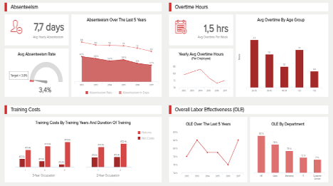
Production Dashboard - Production Quality Dashboard - Manufacturing Cost Management Dashboard - Manufacturing KPI Dashboard - Daily OOE Dashboard
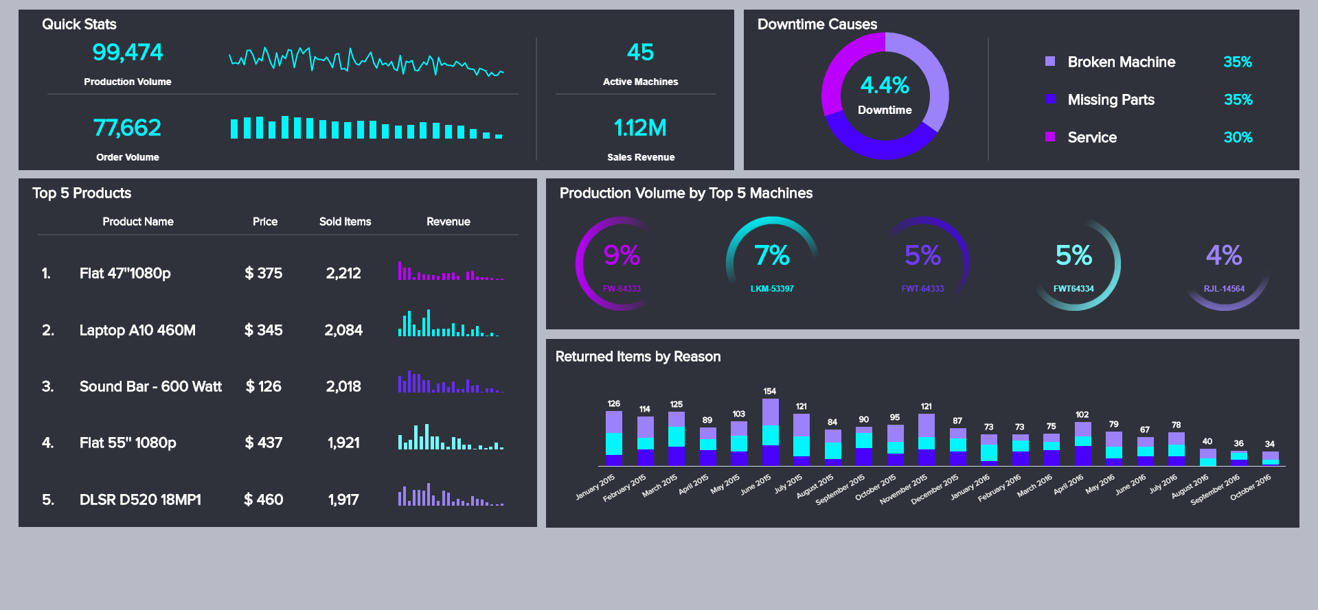
Production Dashboard
Open Production Dashboard in Fullscreen

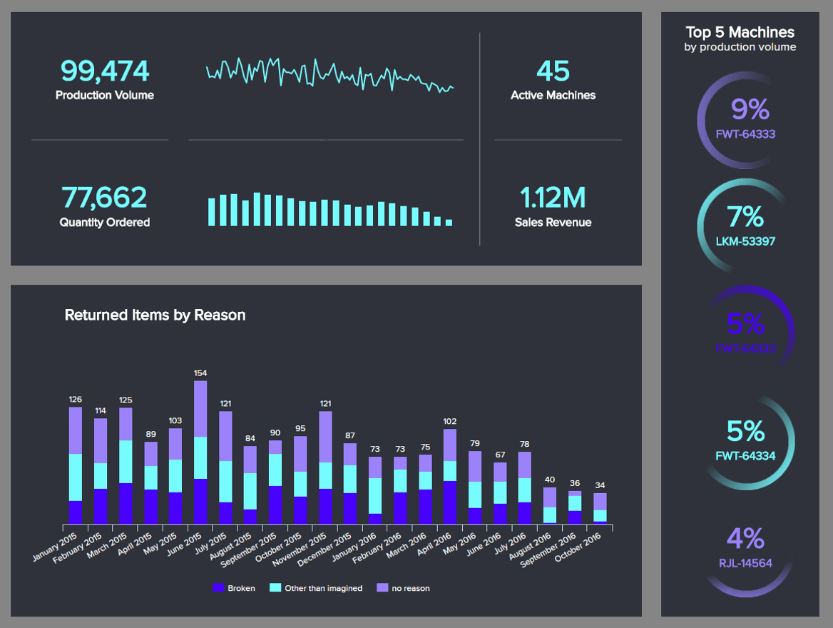
On this first manufacturing dashboard example, we will look at the overall production capacity of an organisation. Having at your fingertip all the important key performance indicators related to the production of your company provides a great overview that helps optimising it. Inefficiency is the nemesis of any manufacturing process, so you must stay alert and track any potential issue, spot any hidden trends that could harm the processes. That’s why generating professional dashboards is critical in this machine-focused industry where even the smallest amounts of data can make a big difference.
Knowing your overall production volume is the first thing. That way, you have an idea of what your active machines are dealing with on a daily, weekly, monthly or annual basis. This is a good metric to compare to with previous or similar periods and spot the differences, analyse them and try to understand the why behind it: a lack of maintenance leading to breakdowns, an under-equipment leading to under-production, an overloaded staff that makes more mistakes? This is the starting point of your analytics process. Parallelising that production volume to the quantity ordered is another interesting move: you can see if you manage to keep up with the flow, or if your factory is totally overflowed and has a hard time facing that demand. That will directly impact your overall sales revenue generated.
When it comes to this production dashboard, you need to know about your equipment. What they produce over time will let you know the importance of each of them, so that you can take extra care of the most productive ones. But let’s not be mistaken: every machine needs maintenance and care, even if it contributes to a small percentage of your production. In assessing this, you will also be aware of your assets, and that will help you in evaluating later the return on asset. In essence, it’s important to keep your production dashboard system clear so that you deal with fewer issues later.
Finally, in a similar vein as for the retail industry, dashboards like this one should look into the returns they receive. Measuring the rate of returns you have is a must-do, to evaluate how performant you are at delivering what you are expected to. The idea is, of course, to maintain it as low as possible: you can set a target you wish to achieve, and if you are above, take adequate measures. Once this is done, delve into the reasons of return: broken item, no particular reason, or on the contrary any other. You need to know what pushed the client to return your goods, so as to tackle the problem at its source and avoid seeing the situation repeated over and over.

When you have evaluated the production of your factories, the next step is to assess their quality. Producing in quantity is good, but only if the quality follows: otherwise, you will never have returning customers, your brand image will be harmed and demand won’t come in anymore. Monitoring the quality of your production is then another major concern.
On this second manufacturing dashboard template, 4 metrics are displayed. The first one is directly related to the last KPI analysed in our previous dashboard example, tackling the returns. As stated, measuring the rate of return is crucial to gauge the performance of your supply chain when it comes to producing an item without any defect, from the deal to the delivery. Measuring this ratio had the objective to reduce it as much as possible, by improving your production processes. To reduce it, you will need to find the reasons, which might be during production. Try to find the root cause, where and when it happened in the process - or afterwards - a return due to the client. Along with this KPI, comes a similar one that must have the opposite attitude: being as high as possible. Indeed, right first time is the percentage that will help you win extra points with your clients: not only will they be satisfied to have what they want directly, but that will also give them no reason to complain about your services. Besides, you will avoid useless expenses as returns are always costly to achieve back and re-process.
The second aspect of quality that is assessed on this manufacturing dashboard example is the defects. When an item is flawed, it is a useless item that will bring you no value as you will not be able to sell it -provided you implement certain price policies on defective, but still usable, products. In any case, the potential revenue generated by a defective item is not profitable. Make sure then to evaluate how many of them are produced each month and so as to monitor them. Just like for the returns, you should also find a reason for these defects: a packaging problem, a non-compliance to product spec or non-compliance in the manufacture, an under fill, or any other thing you can witness. With this assessment, you will know what to deal with first, and where to allocate more resources that will ensure the right production quality and avoid future defects.
With such manufacturing dashboards, you can visualise the right analytics at the right moment, and take advantage of modern dashboard creator software. It offers you flexibility and will help you remain competitive and informed in such a global marketplace with so many challenges at stake for your business.
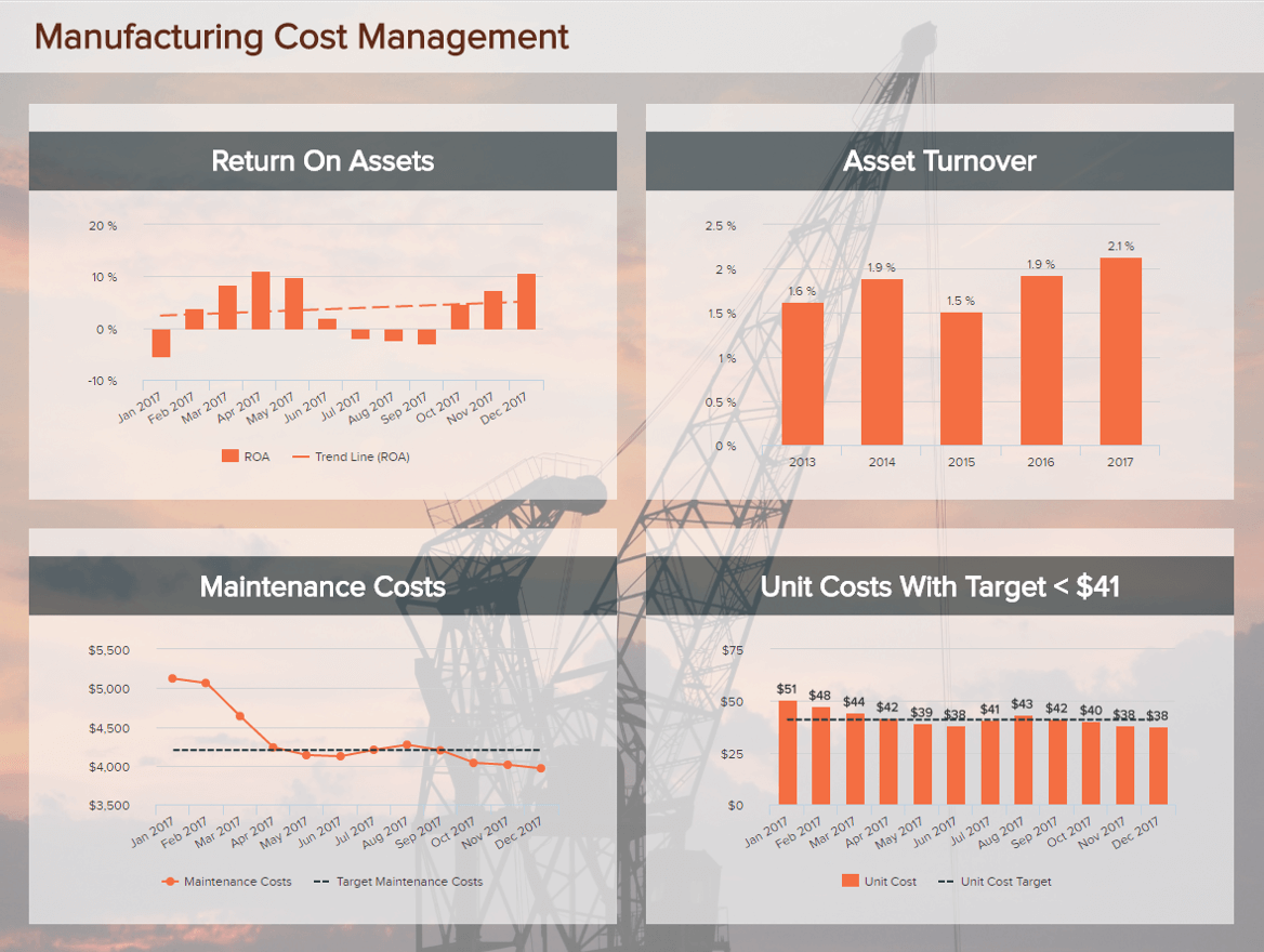
In today’s economy, the manufacturing industry is highly challenged at every level: production must run as efficiently as possible, with the highest quality as possible while at the same time, minimising the costs. With a manufacturing dashboard template gathering your most important metrics related to cost management, you can take a deep breath and relax - all you need to monitor is here.
Continuing with our automation dashboard examples, you need to keep in mind that you often are evolving in an asset-heavy industry, which means that knowing what are your assets and what are their value is key. Measuring the asset turnover ratio will then provide you great insights, as it represents the revenue of your sales relative to the value of your assets; that is to say that it helps you assess if your assets are generating revenue and to which extent. In general, the higher this ratio, the better it is for your business as it means that you create more value for each dollar of asset you have. To have an idea of your efficiency, you can compare your ratio to other industry-like businesses. Similar to this metric is the return on asset, which measures the capacity of your organisation to generate profit for each dollar spent on asset. Keep in mind, this metric distinguishes itself from the previous KPI because it focuses on profit by using the net income for its formula.
When talking about costs in manufacturing, maintenance makes up for an important part. It is an important aspect to take into account because it deals with the core of your business. At first, maintenance costs can make up for a big part of your budget; but the idea is to lower them in the long run. They will never disappear and need to always have a place in your expenses, but good maintenance is implementing adequate preventive measures to avoid future useless expenses.
A final metric on this manufacturing costs management dashboard is the unit costs, and lets you know how much money is required to produce one item so that you can set the appropriate price to make a profit on this item. The evolution over time should be a decrease, as, generally, practice will grow while equipment investments will decrease.
Collecting data and working with it in your company is a great advantage you have over competitors, but it is just the beginning of your work. Let’s take a look how you can ease your strategic initiatives with a high-level KPI dashboard – next.
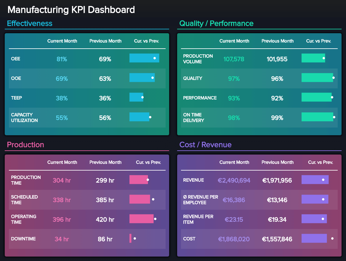
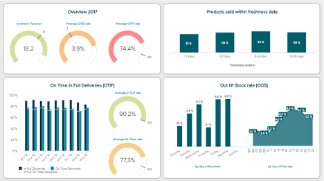
The next in our manufacturing maintenance dashboard examples is focused on high-level metrics, typical for C-level executives that need a birds-eye overview of strategic initiatives and results. Created with manufacturing dashboard software, this visual, designed in a KPI scorecard style, represents 4 pillars of successful long-term sustainable management: effectiveness, quality and performance, production, cost and revenue. Each of these focal points enables high-level managers to monitor, and optimise relevant metrics, as well as improve their strategies.
This industrial dashboard starts with the effectiveness that covers overall operations (OOE), equipment effectiveness (OEE), total effective equipment performance (TEEP), and capacity utilisation. To understand, measure, and enhance current performance, these metrics need regular tracking. They will help you to accurately forecast, plan, and schedule various parts of the production process and provide a stable manufacturing operation for your customers. In this example, we can see that the current month surpasses the previous with most metrics, which means that the effectiveness is quite successful.
We continue on the right side, where the dashboard shows quality and performance, the production volume, and on-time delivery metrics, depicting the current month, previous month, and the comparison between both. You can see how the current month has outperformed the previous month, with an exception of the on-time delivery. Here it makes sense to investigate why, although the deviations are only 1%.
The production part shows a focus on time: production, scheduled, operating, and downtime. These metrics are organised just like the previous ones, with comparisons and milestones between the current and the previous month. We can see that the production time increased while the downtime decreased – that could mean that the machines have performed quite well and had fewer issues to deal with or you managed to organise the maintenance time much better. Finally, the cost and revenue part of the manufacturing quality dashboard is purely monetary and helps executives to determine whether their strategic initiatives bring positive business results. In this case, we can see that the revenue is around 20% higher than the previous month, but not only, as the revenue per employee and per item increased as well. The final item on this dashboard shows the costs, which increased in comparison to the previous month and it’s worth finding out why. Is it because the production volume increased, or maybe because the production time also increased, hence, they both affected the costs of production. Nevertheless, this dashboard provides a simple means of monitoring the strategic plan and goals with the help of modern software. That way, you will have more time to focus on optimising performance, and less time spending at manual calculations and reporting.
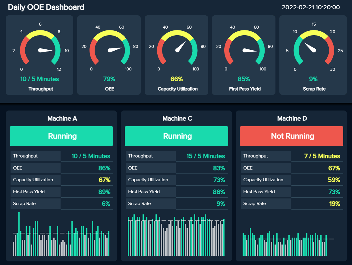
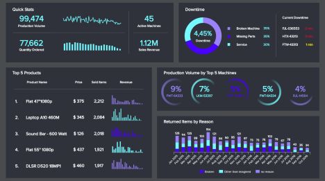
Our last template focuses on the overall operating effectiveness (OOE). We already covered this metric in some of our other examples, however, it is an important indicator that needs detailed attention on its own. Essentially, the OOE is a metric used to track the availability of general production lines from beginning to end. It is similar to the overall equipment effectiveness (OEE), but they differ in the scope they measure. While the OOE monitors availability from beginning to end, the OEE monitors it just within the time the machines are scheduled to run.
Moving into the example, this dashboard has a short-term focus. All metrics displayed on it are monitored daily and in real-time to allow manufacturing managers to supervise the performance of their production at a glance. To make this possible, we get insights into five relevant operational metrics tracking the overall performance of the machines: the throughput, OEE, capacity utilisation, first pass yield, and scrap rate. Each of them is displayed in a gauge chart with the colours red, yellow, and green to easily identify when something is not going according to plan.
Going more into detail with these performance indicators, we first get the throughput. This metric measures the number of units your machines can produce in a given time. This number should be as high as possible as this can give a company a great competitive advantage. Paired to this, we have the capacity utilisation rate. This indicator tells us how much of the production capacity is currently being utilised. Here we can see that this factory is currently only running at 66% of its capacity which means there is more potential to increase operational efficiency and it needs to be looked into. Moving on, we have the first pass yield (FPY). Also known as the throughput yield, it measures the quality and performance of a fabrication line. Companies should aim to have a high FPY as it indicates that processes are reliable. Lastly, we see the scrap rate, a metric that tracks the percentage of failed products. Naturally, this number should be as low as possible to ensure that no resources are lost and demand is met.
As mentioned, all the metrics tracked on the top portion of the dashboard are covering the overall performance of the machines. At the bottom portion, we get a detailed breakdown of each of these indicators for individual machines. For instance, we can see that machines A and B are working with a low percentage of capacity utilisation which is clearly affecting the overall utilisation percentage of the organisation. This allows you to take a deeper look into both of these machines and find solutions to improve their performance.
Businesses are more and more globalised and resources and functions are scattered, needing smart data analytics in a collaborative environment. Leveraging these analytics thanks to customised manufacturing dashboards is the next step you want to take to improve processes, gain unique insights, and boost your performance. If you want to take your manufacturing company onto the next level, datapine is right here to help. Use our dashboards as templates, connect your data sources, easily set up and customise your visuals, and try our dashboard software for a 14-day trial, completely free!


Setup only takes one minute. No credit card required!