Procurement Dashboard examples
A procurement dashboard enables purchasing manager to efficiently track, evaluate, and optimise all acquisition processes within a company with the help of procurement KPIs such as the compliance rate, purchase order cycle time, supplier defect rate, and many more.
The procurement department is a function that is found in most companies, whichever their type and industry: it is not limited only to manufacturers of products and goods, but is also a business unit for services companies, working with freelancers, agencies, etc. It is a strategic function linking the needs of a firm, and the suppliers or contractors. It plays a key role in the competitiveness of an organisation. To be able to thrive in our competitive economy, optimising processes with the help of a powerful procurement report will, ultimately, deliver value across the board. But not only, as a modern dashboard designer brings all your data under a single interactive roof, where analysis enables users to save time, and focus on what really matters: generating actionable insights.
Here we discuss 5 professional procurement dashboards created for various functions within the department:
Procurement KPI Dashboard - Procurement Quality Dashboard - Supplier Delivery Dashboard - Procurement Cost Dashboard - Purchasing KPI Scorecard
Procurement KPI Dashboard
Open Procurement KPI Dashboard in Fullscreen

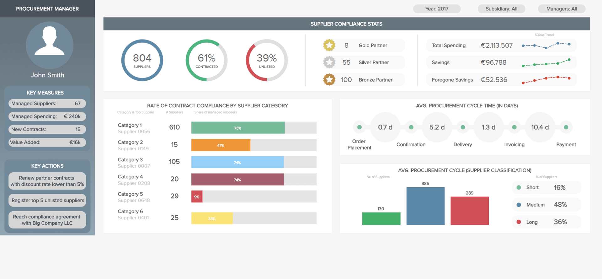
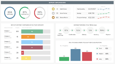
Our first procurement KPI dashboard provides an overview of the various indicators a procurement department works with. The first KPIs displayed are some statistics about the suppliers. Among the 804 suppliers, 61% are contracted, meaning that they agreed with the compliance contract of the contracting company, while 39% preferred not to settle on basic agreements – but still work with the company, as unlisted vendors. These basic agreements encompass various requirements such as the delivery time, the reaction time, special discounts, etc. The contracted suppliers can then be classified and get certain partner status like gold, silver, or bronze – usually awarded to the ones that provide the company with good terms of agreements, interesting discounts, and who take care of the relationship with the company. On the right part are exposed the costs and savings trends over five years. We see that the suppliers account for over two million euros in spending, but that the procurement department managed to save more than €96,000.
The second KPI displayed on that procurement KPI dashboard focuses on the compliance rate per category: the highest compliance rate goes to the first category, which also has the highest number of suppliers, with a 75% rate of contract compliance for 610 of them. The lowest rate goes to the fourth category with 9% contract compliance for 29 suppliers.
Moving forward onto the final metric on this procurement KPI dashboard, we have an illustration of the average procurement cycle time expressed in days. This cycle time covers the end-to-end ordering process, from placement to the confirmation, order delivery, and finally the invoicing. Here, we see that the overall average is of 7.2 days, with the moment between the confirmation and the delivery of the order for the invoice being the longest (5.2 days).
Working with an interactive purchase dashboard summarising the procurement department's activities and relationship with suppliers, or highlighting procurement's actual results (as we will see on our last dashboard) will not only help in managing the department, but also in building its brand. These dashboards are a real help for top management decision-makers and strategy builders. Having an overview and monitoring all your processes from purchase orders management to knowing your different types of suppliers will let you optimise your procurement process and more generally, the profitability of your company.
Our next procurement analysis dashboard focuses on quality related KPIs between the department, and its vendors, and suppliers. Quality, as you probably know, is extremely relevant in procurement, and by monitoring certain metrics, you can optimise your relationships with suppliers, generate better contracts, and maximise business value. A supplier dashboard such as in our visual example can help you on your way.
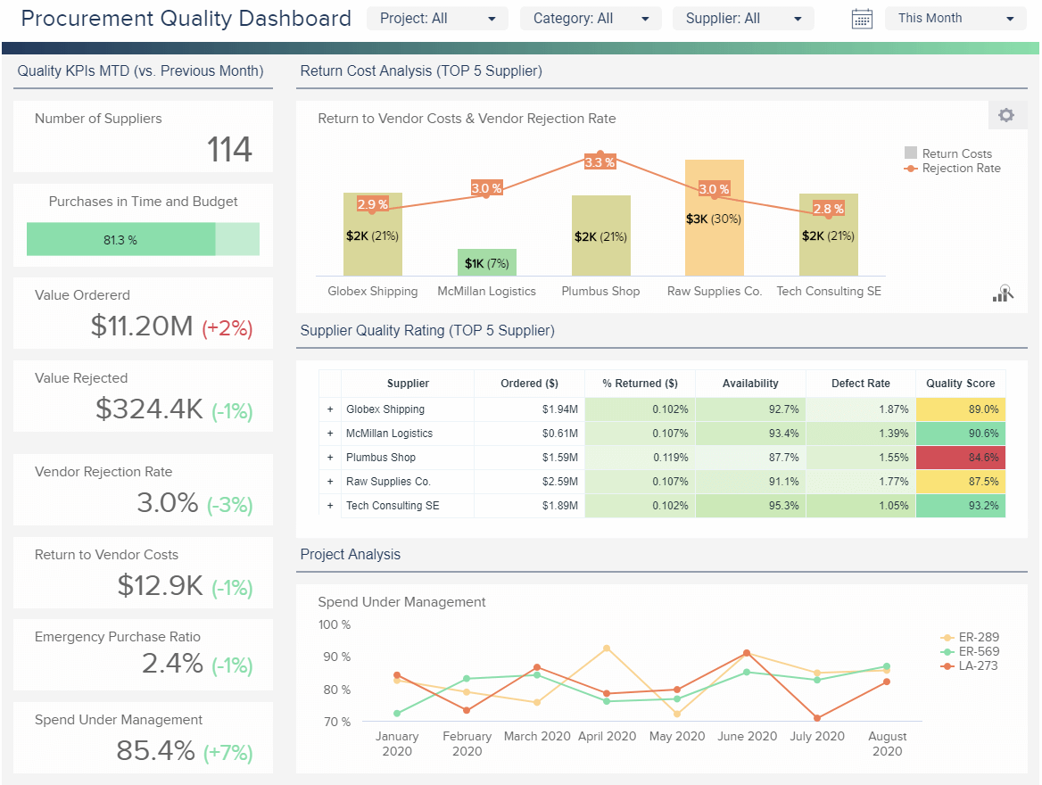
On the left side, we can see a clear overview of the most important stats, starting with the number of suppliers. You can see that the value ordered has increased by 2% in comparison to the previous months, while the value rejected decreased, along with the vendor rejection rate. This is a good signal that the ordered products have slightly better quality. Return to vendor costs, emergency purchase ratio, and spend under management have all shown a positive improvement in comparison to the previous month which makes your efforts worthwhile, and you should continue improving your established strategy. On the top right side of the vendor management dashboard, you can find the return costs analysis by the top 5 suppliers. The costs and rejection rate are critical indicators of the standard of the procurement department and they should be kept at a minimum. In our example, you can see that some vendors have higher rejection rates and costs, but some have lower. It makes sense to analyse what creates such results and if both can be lowered as much as possible.
The supplier quality rating is also organised by the top 5 suppliers, where a table with conditional formatting expresses the name, the total amount ordered, the percentage of returned items, availability, defect rate, and quality score. You can immediately spot how supplier no. 3, Plumbus Shop, has the lowest quality score, which you can use to renegotiate the prices or investigate further what happened to achieve such a result. On the other hand, the final supplier listed, Tech Consulting SE, has the best results in all categories. Here it makes sense to see what worked so you can apply those findings to other suppliers that have poorer results.
The project analysis part of our procurement quality dashboard is focused on spend under management that controls and optimises a company’s spend. If this value is decreasing, you need to re-evaluate your procurement processes, and establish clear processes that are openly communicated with employees. This metric needs to be monitored regularly in order to make sure the defined procurement processes are respected, and opportunities for reducing costs and forecasting future expenses are present.
Finally, such procurement analytics examples will ensure you have the right data at the right time, without the hassles of manual calculations and endless spreadsheets. Keep in mind that the procurement department continuously changes, hence, your management processes should be optimised constantly in order to generate sustainable business development and growth.
Our third procurement dashboard focuses on a supplier’s ability to provide you with the right products or services, at the right moment. The first KPIs displayed at the top give an overview of one supplier’s performance, while the lower part of the dashboard is a snapshot of the overall performance of several different suppliers. With an interactive dashboard tool like datapine's, you can easily add filters on your dashboard and focus on a specific supplier's performance, compare it to others or to the overall.
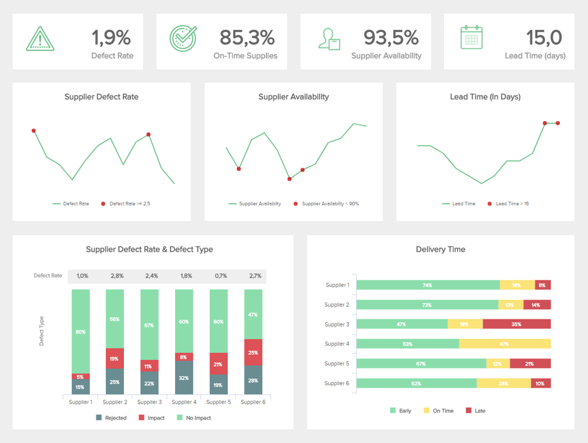
The defect rate is a metric used to measure how many products received are not meeting the quality requirements and compliance specifications. For this particular supplier, it is of 1.9% and the trend line has been rather irregular; he or she managed however to maintain that rate under the maximum defect rate of 2.5% except in two points. This defect rate can be further compared to the rest of the suppliers with the bottom left chart displaying each supplier’s defect rate broken down into types. The supplier number 1 is obviously more reliable than the others, as it has 1% of defective products and 80% of them have no impact, meaning that the defect might come from another part of the process, like a delivery issue or a payment issue.
Moving on to the second top KPI, on this procurement dashboard example our focus-supplier has 85.3% of on-time supplies, which is within the range pre-set, and an average of 93.5% availability. The supplier's availability: it evaluates their capacity to respond to demand by measuring the number of times goods were available on their side. It gives you an idea of the reliability you can place in your suppliers, and should ideally stay over 90%. For our specific supplier, the evolution of the availability has also been uneven over the last 12 months, and was recorded three times beneath the minimum of 90% availability. However, since then, it has only been on the increase.
Another important metric is the lead time. Expressed in days, it refers to the capacity to fulfil an order, from the initiation to the execution of the process. The lead time differs from the purchase order cycle time because it encompasses the whole process until the delivery. Here, the lead time is of 15 days and a maximum value of 16 days, that got exceeded twice. If the lead time keeps on growing, measures should be taken to address the potential issues.
The last metric on this procurement dashboard is the delivery time. Just like for the defect rate, the delivery time is analysed by parallelising several other suppliers. Overall, supplier 4 performs better as it doesn't have any delayed supply even if it has fewer early delivery than supplier 1 for instance, with 53% early against 74% for supplier 1 – that one still has 8% of his supplies delivered late.
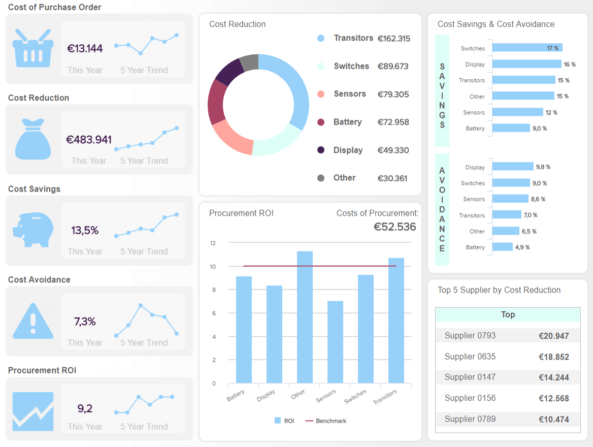
Our next procurement dashboard template aims attention to the costs and purchases. To optimise said costs, and anticipate the needs of the different business units to save valuable time, it is essential to oversee the entire purchasing area in one central place. The first column gives a snapshot of all the KPIs related to costs and savings, which are further detailed on the right side of the purchase order dashboard. The first of them gives us an idea of how expensive the internal process of an order is, from its creation to the invoice closure. Here, we have the entire costs of purchases displayed and their trend over five years, which tends to increase – may be simply because the total amount of orders increases too.
Beneath are two other indicators that actually convey the same information, but are expressed in two different ways: costs reduction and savings. The first one, can be measured easily by directly comparing the past costs versus current costs for the same goods or services, over the same period of time. This year, the cost reduction amounts to €483.941, which is expressed as a percentage with cost savings of 13,5%. This procurement dashboard breaks it down into several categories (switches, battery, display…), to identify more easily any rationalisation opportunities. It plays a key role within the procurement department, as it measures the "hard savings" realised over time, and helps in monitoring the financial performance of the purchasing function. Top management uses this figure because it has a direct impact on profit and loss. Ideally, it is a metric you want to sustainably increase in the long-term.
To continue, another key indicator on our procurement dashboard is unfortunately too often overlooked by top management, because it does not directly affect the income statement and does not appear on the bottom line in a tangible, quantifiable way. Still, the cost avoidance has a positive impact as it represents all the potential future costs avoided by certain measures, like replacing parts of an equipment before they fail and damage other parts, or negotiation successes bypassing cost increases on future purchases. These soft savings are thus creating strategic value by targeting strategic spends like new investments or new technologies. Monitoring them alongside the hard ones (of cost reduction) is a best practice to adopt, as we can see with the metrics on the top-left part of the purchasing dashboard, where they are expressed as a percentage. The cost avoidance for this year amounts to 7.3%.
Finally, the central metric of this procurement dashboard is one of the most important ones when it comes to evaluating the actual worth of your internal procurement investments within the context of your company. It is not calculated as regular ROI (with the formula ROI = (gain from investment – cost of investment) / cost of investment), but instead by dividing the annual cost savings by the annual internal cost of procurement, and is expressed as a ratio. This ROI should ideally have a massive payback of ten times for internal procurement investments. This year, we see that the procurement ROI is of 9.2, which is a little under the benchmark target.
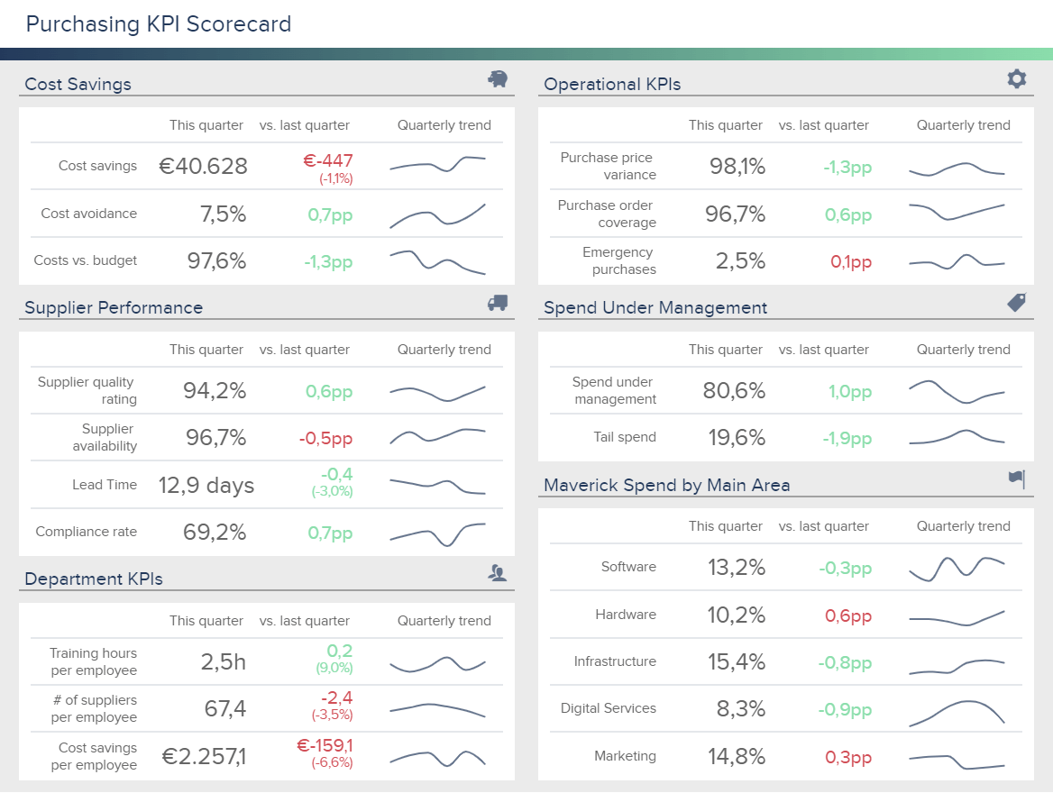
Our last procurement dashboard example is a purchasing KPI scorecard that has a long-term focus and it provides an overview of 5 key areas that any procurement department should track to ensure efficient spending: costs savings, operations, supplier performance, spend under management, department KPIs, and maverick spend by main area. Thanks to its scorecard format, this template is the perfect tool to measure progress against the previous period and extract conclusions. Let’s dive into it.
Starting off at the top, you first get KPIs related to the performance of your cost-saving efforts. On one hand, cost savings are tangible savings that can be reflected in the company’s budget. For example, contract negotiations to get deals and discounts. On the other hand, cost avoidance refers to any pre-emptive action to avoid extra costs such as investing in equipment maintenance to prevent future costs of fixing unexpected damages. In our example above, we can see that there is a -1,1% difference in savings compared to last quarter.
Moving on, the dashboard offers operational KPIs that allow you to monitor the day-to-day business operations. For example, the purchase price variance (PPV) is the difference between the purchasing price of an item or service and the actual cost of it. A positive price variance means the procurement team is effective in getting favourable pricing deals, while a negative variance can mean that the actual cost is higher than the standard one. Paired with this, you get insights into the spend under management, where you can observe the amount of spend that is managed by procurement out of the total company spend.
The supplier performance section covers indicators that let you understand the quality of your vendors as well as their accessibility and compliance. As seen above, the availability rate is a bit lower this quarter which can lead to higher costs for not being able to cover demand. On the other hand, employee performance KPIs such as training hours or costs savings per employee can shine a light on areas that could be improved. While these are not as critical as cost savings or operational indicators, they are still very important for the success of the department.
Last but not least, we have the maverick spending by main area. Maverick spend is defined as off-contract spending or spending with a non-preferred supplier, and it represents a challenge for many organisations. This is because buying from off-contract suppliers is more expensive as you don’t get the discounts that are agreed during the negotiation process with your preferred vendors and it is risky as it might not follow concrete company regulations. If it becomes a frequent practice, maverick spend can lead to greater costs. Therefore, it is necessary to measure it closely and for different areas.
Most procurement professionals are used to working with raw data, and face difficulties extracting it from various sources – ERP software, databases, csv files, etc. Then comes the problem of presenting it in a meaningful way to stakeholders and decision-makers to allow them to easily understand the big picture and make sound decisions. Using modern dashboard software like datapine to create professional procurement dashboards is a way to overcome these difficulties and drive your performance forward. Are you ready to dive into your own analysis and create stunning dashboards? Try datapine for a 14-day trial, for free, and take your procurement department to the next level!

Setup only takes one minute. No credit card required!